Multi Device Video Player Configuration
ADTECH · LOGIC · B2B SAAS · PRODUCT DESIGN
Truvid account managers configure video players for publisher websites. The legacy interface exposed interdependent technical settings that caused configuration conflicts across devices. Working with product and engineering, I redesigned the setup flow around predefined formats and independent Desktop and Mobile configurations - all driven by a single, scalable widget tag.
Role
UX architecture, UX UI design, DEV handoff and design QA
Collaboration
Product Manager, Front-end & Back-end Engineering, QA
Target users
Account Managers, Demand Ops and QA
Status
Shipped in New Admin platform
April - August 2025, April - August 2026

Problem Framing & Discovery
Research & Discovery
To move beyond assumptions, I conducted a two-phase discovery process to diagnose why player configurations were failing in the field:
100% Response AE & AM Survey: Distributed a quantitative survey to the entire Account Executive and Account Management team. With a 100% response rate, the data revealed that over 70% of support escalations stemmed from setting dependencies (e.g., conflicting layout and orientation inputs) rather than actual system bugs.
Qualitative User Interviews: Conducted deep-dive interviews with Media Team leads and Demand Ops managers. I observed their live setup workflows, mapping workarounds - such as keeping external cheat sheets to remember valid property combinations.
Key Research Finding: Users didn't want "more customization controls" - they wanted guaranteed valid setups tailored to specific publisher placements.
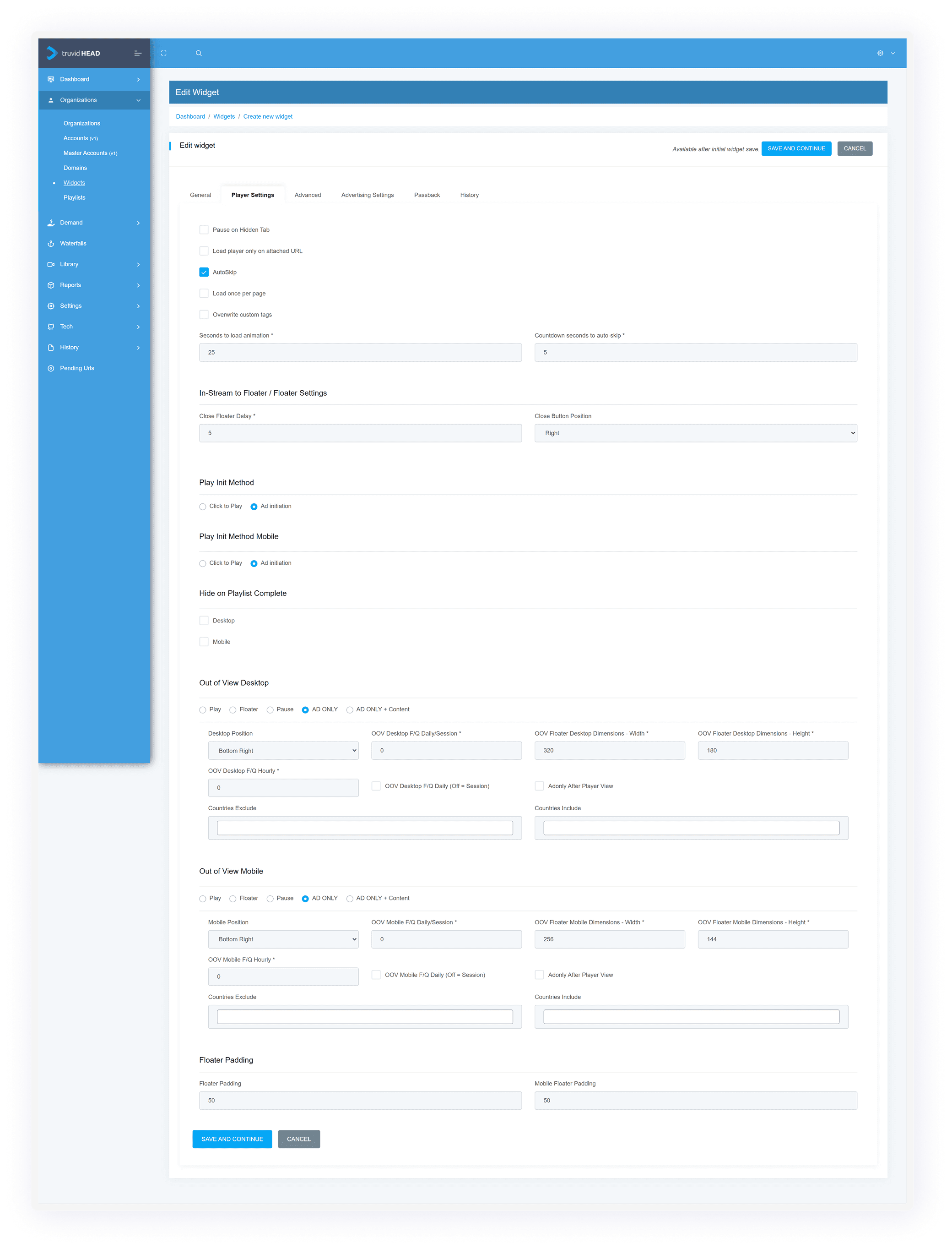
Widgets determine how Truvid’s player, videos, and ads behave on live publisher sites. Misconfigurations directly harm monetization, site performance, and user experience. Through observing account managers and reviewing support logs, I identified three structural bottlenecks:
Cognitive Overload: Over 30 raw technical fields were exposed simultaneously on a single page, regardless of their relevance to the player type
Fragile Dependencies: Users had to manually calculate valid combinations of layout, orientation, and placement controls
Device Conflicts: Desktop and mobile rules were mixed into one form, creating invalid configurations across device environments
The Design Goal
The redesigned experience needed to make widget creation faster and more predictable while still supporting complex operational requirements.
I defined four principles:
Start with the intended format - not individual technical properties.
Show only settings that apply to the current configuration.
Separate desktop and mobile decisions clearly.
Create a structure that can scale to future formats and capabilities.

Decision 1: Predefined Formats Over Independent Properties
The Solution: Instead of requiring users to configure orientation and layout as separate fields, I introduced 5 predefined formats: In-Article Horizontal, In-Article Vertical, Carousel, Floater Horizontal, and Floater Vertical.
Selecting a format automatically enforces orientation, aspect ratio, and valid player rules.
Iterations & Rejected Explorations:
Exploration A (Standalone Format Step): I initially tested making "Format Selection" its own dedicated step before the main form. Why it changed: It added unnecessary step-clicks and felt disconnected from device configuration. I integrated format selection directly into the device setup context.
Exploration B (Rich Illustrated Cards): Early concepts used large visual illustrations inside each format card. Why it changed: The images consumed excessive vertical space, pushing critical configuration settings below the fold. I streamlined them into compact, scannable selection cards.
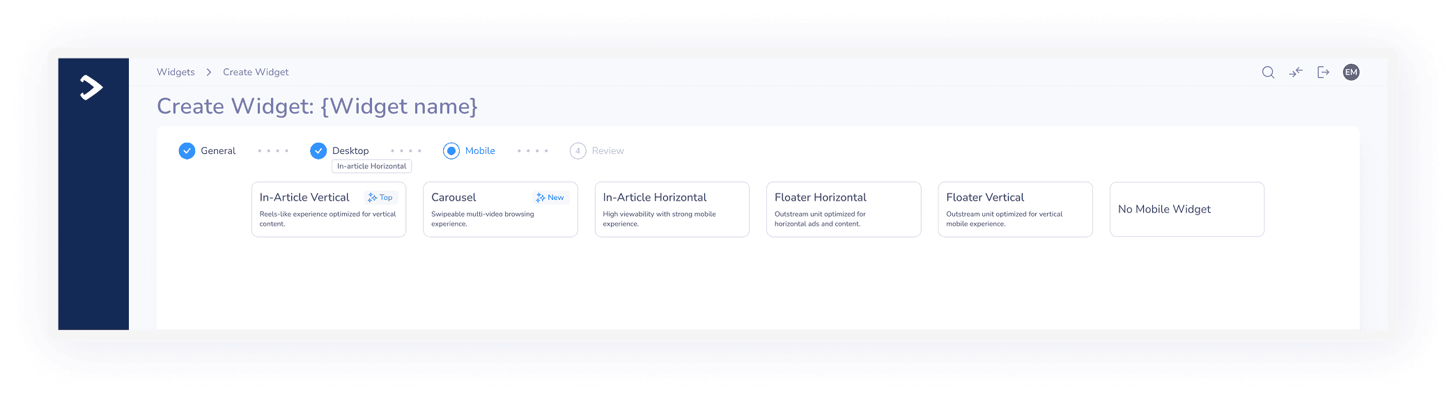
Choosing a predefined format establishes orientation and valid layout logic automatically.
Micro-Copy & Label Simplification
Part of reducing cognitive load meant fixing the disconnect between developer parameters and how account managers actually discuss widgets. I renamed over 30 technical fields across the system into clear, domain-specific terminology.
Prototype Testing & Usability Verification
Before finalizing the interface, I built an interactive prototype in Figma and conducted structured usability testing sessions with internal power users and Account Managers:
Task-Based Testing: Participants were asked to configure a multi-device setup (e.g., In-Article Horizontal for Desktop + Floater Vertical for Mobile).
What We Measured: Task completion speed, error rate, and discoverability of progressive disclosure accordions.
Key Insight & Refinement: During early prototype tests, users missed settings input which resulted in errors and delays. I set default values in all fields for each widget type.
Decision 2: Decoupling Desktop & Mobile Under One Tag
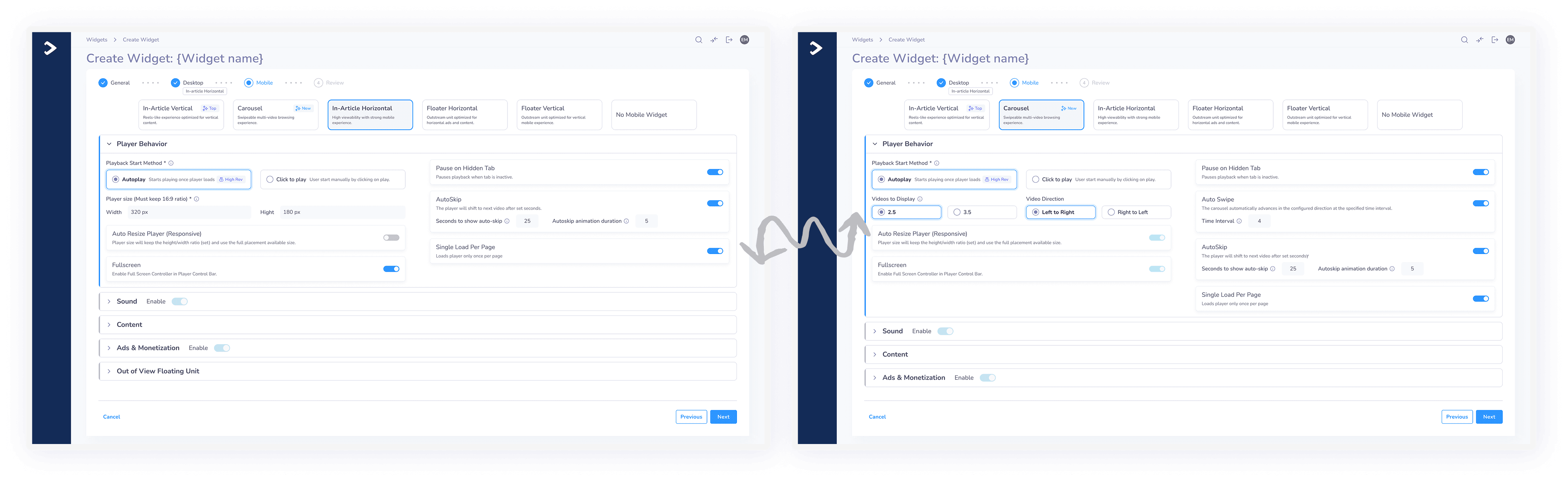
The Solution: To honor the publisher constraint of a single tag while eliminating device conflicts, I decoupled the setup into a linear, step-by-step stepper: 1. General Identity -> 2. Desktop -> 3. Mobile -> 4. Review -> 5. Embed Code. Within each step, progressive disclosure ensures only settings supported by the selected format are displayed.
Micro-Interactions & Collaboration
Eliminating the Step-Level Save Button: I initially placed explicit "Save" buttons at the top of each device section. After syncing with back-end engineering, they confirmed seamless step auto-persistence, allowing us to remove top save buttons and clean up header clutter.
Header Sound Toggle: To save time for account managers who didn't need audio customization, I added an Enable/Disable toggle directly to the accordion header, allowing users to skip expanding the section entirely.
Smart System Defaults
In the legacy form, required fields were often left empty, leading to runtime JavaScript crashes on live publisher sites. Working with back-end engineering, we established intelligent system defaults across all fields. Every new widget opens with pre-populated, battle-tested values (e.g., standard 16:9 ratios, default volume levels, and safe frequency caps), allowing users to launch standard setups in seconds without leaving missing-data bugs.
Section-Level Shortcuts & Micro-Interactions
To speed up repetitive workflows for power users, I introduced active toggles inside section headers: Users can enable or disable entire setting categories (like Sound or Ads & Monetization) directly from the collapsed accordion header without expanding the section.
Decision 3: Balancing Monetization, User Experience & Migration
Balancing Revenue Yield & Viewer UX: Floating out-of-view units generate high ad revenue but can easily degrade viewer experience. In the Out-of-View section, I introduced a Viewability & UX Balance Indicator to provide account managers with real-time feedback on how their positioning rules impact revenue versus user experience.

Eliminating Invalid States with BE Defaults: Partnering with back-end engineering, we established intelligent system defaults across all player properties. No required fields are left blank, preventing runtime script crashes on publisher sites.
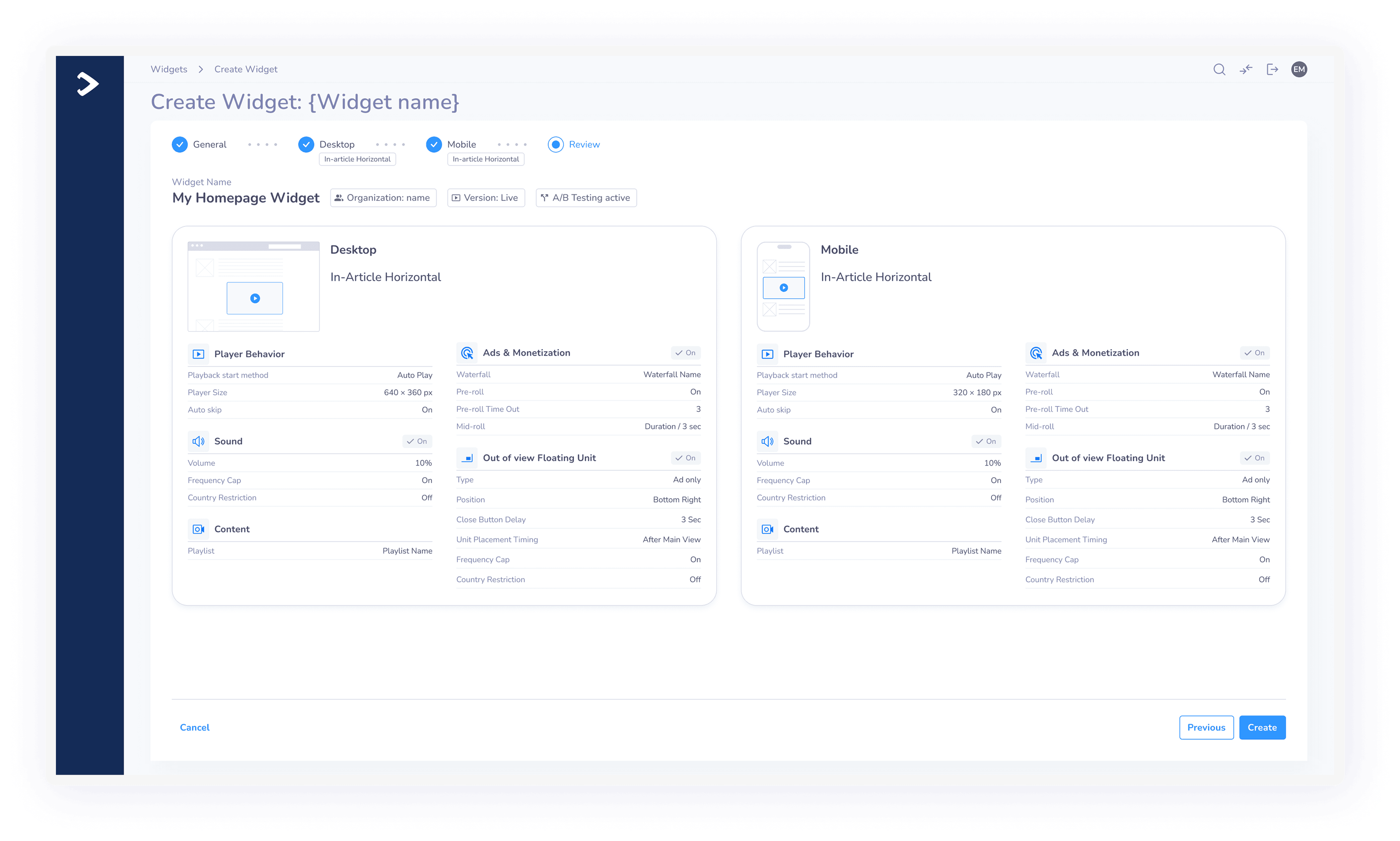
Introducing the Visual Review Step: Because configuring a multi-device player involves many decisions, I added a dedicated Review Step before code generation. Here, full player illustrations and rule summaries allow users to verify their Desktop and Mobile configurations side-by-sid.
Old Admin -> New Admin Migration Logic: Working with back-end leads, we co-designed a migration fallback logic ensuring full backward compatibility:
Migration Scenario | Old Admin | New Admin |
|---|---|---|
Create New Widget | ❌ Disabled | ✅ Fully Supported |
Edit Existing Legacy Widget | ✅ Supported | ✅ Opens with custom code intact |
Edit Widget Saved in New Admin | ❌ Redirects to New Admin | ✅ Fully Supported |
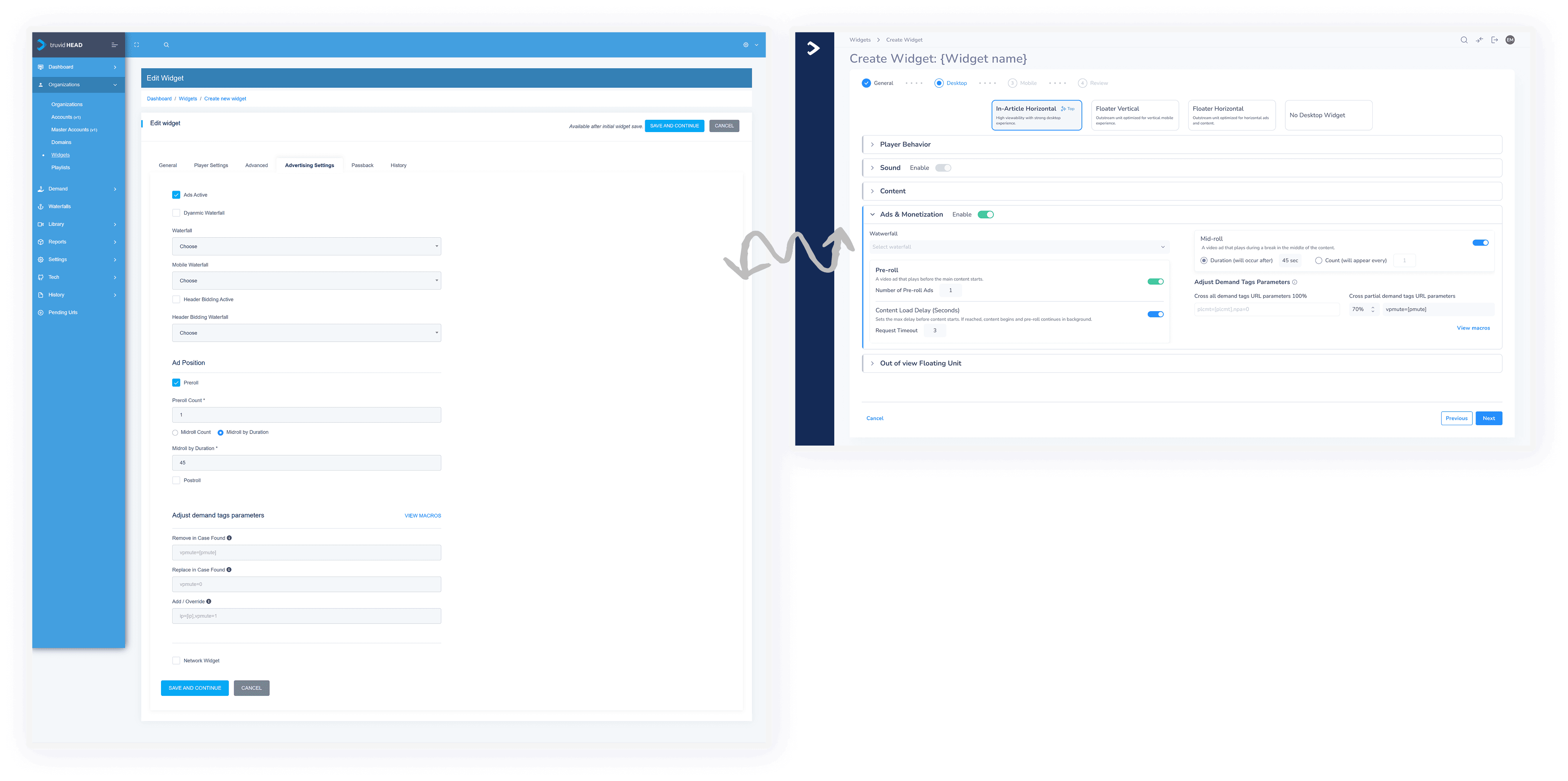
System Validation & Error Prevention
Because misconfiguring a widget directly impacts publisher ad revenue and site performance, validation was built as a multi-layered safety net rather than relying on late error toasts:
Structural Validation (By Design): Predefined formats automatically lock out incompatible orientation and layout parameters before the user even sees them.
Real-Time Field Validation: Inputs like custom width/height or frequency capping validate syntax and boundaries in real-time with inline error messaging.
Step-Level Enforcement: Step navigation and the final Save/Create button remain disabled until all mandatory fields within the current step pass validation checks.
System-Level & Duplicate Validation: When naming or duplicating widgets, real-time API checks prevent duplicate naming collisions across the organization.
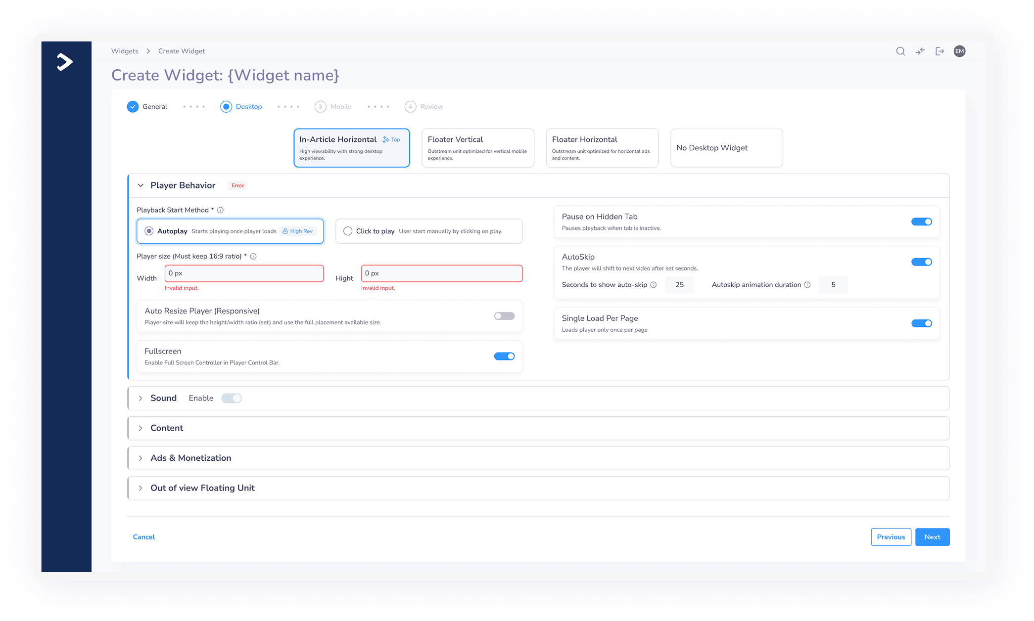
Operations Hub & Project Impact
Beyond Creation - The Widget Management Hub: The redesign also overhauled the main Widgets table. Operational teams can filter by format, status, and device environment, as well as perform batch actions like cloning, modifying A/B split traffic, and retrieving embed tags.
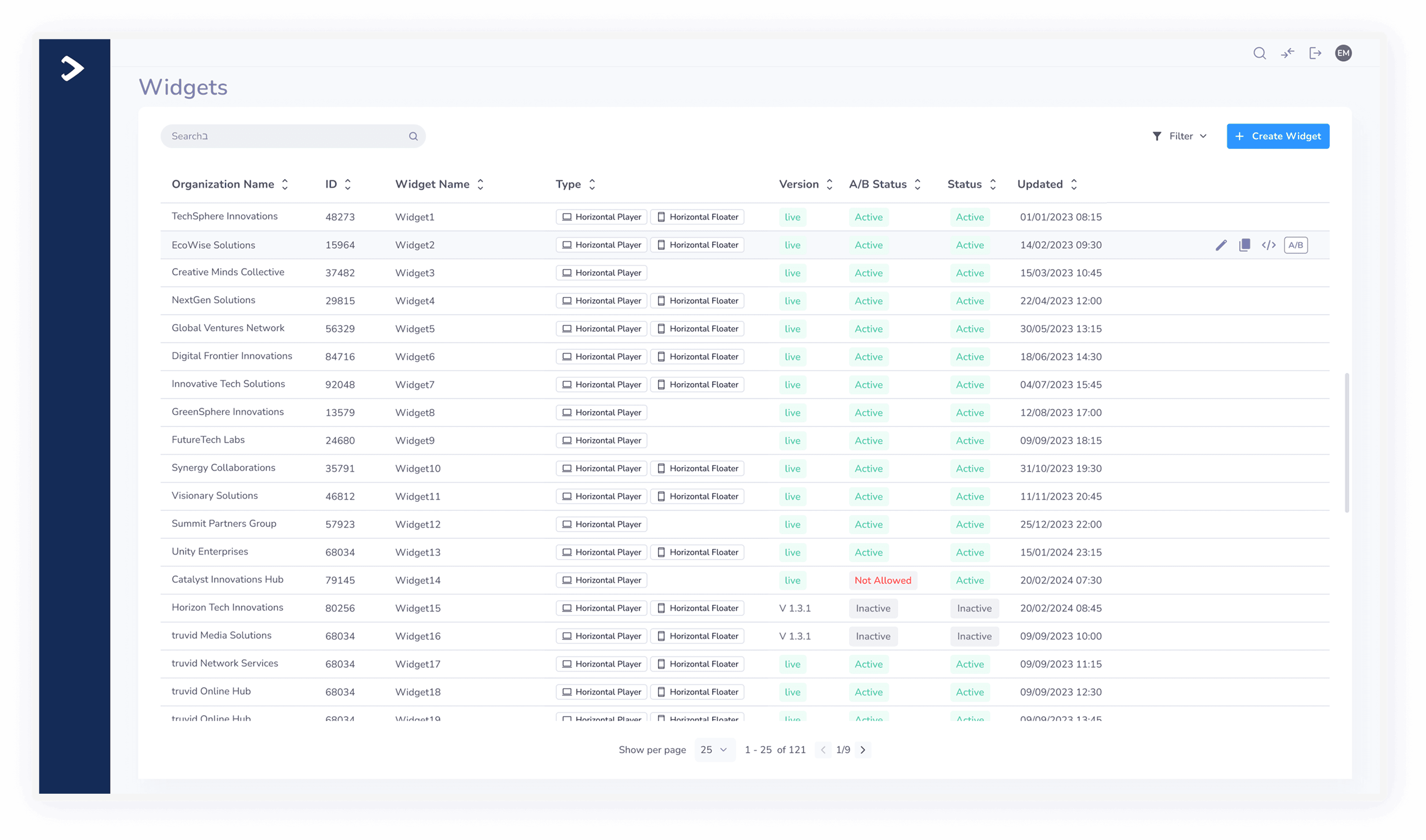
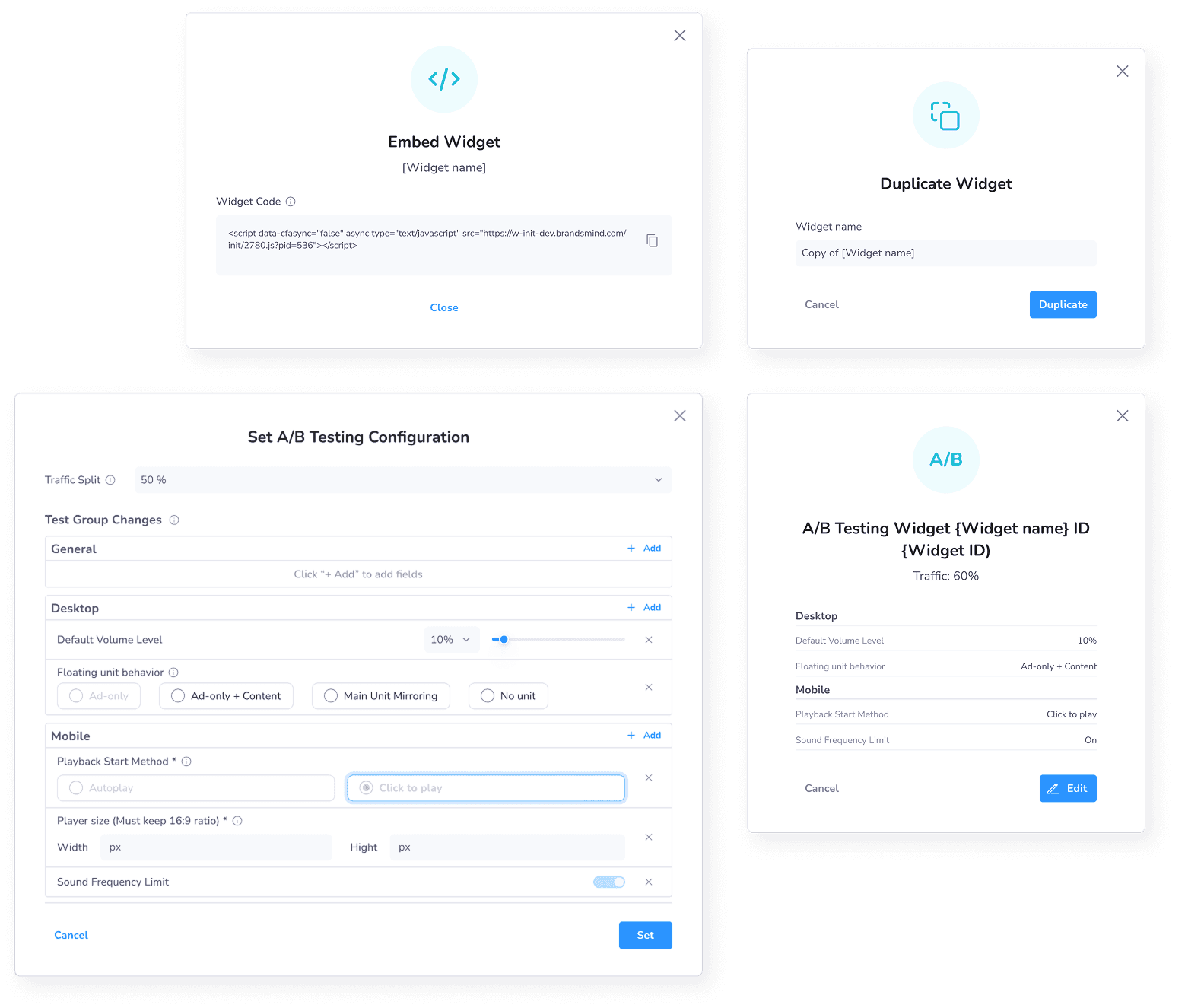
The updated Widgets table acts as a central operational hub for Media Teams, Demand Ops, and QA
Decision-Maker Alignment & Pre-Dev Review
Because changing the player configuration architecture impacted core business logic, monetization rules, and publisher scripts, I led a formal Design Reflection & Alignment Session with key executive decision-makers (Head of Product, R&D Tech Lead, and Operations Leadership) prior to developer handoff:
Trade-Off Presentation: Walked stakeholders through rejected explorations (e.g., full free-form inputs vs. rigid predefined formats) and demonstrated how predefined formats protected ad yield while cutting support load.
Engineering Sign-Off: Secured technical alignment on the single-tag decoupling architecture and agreed on smart back-end default values to eliminate empty-field errors.
Phased Migration Agreement: Established buy-in on a fallback migration logic for legacy widgets, ensuring no publisher code was broken during the rollout.
Delivery Status & Measured Outcomes:
Status: Fully shipped in production as the primary widget configuration hub in the New Admin platform.
Operational Impact: Successfully eliminated setting dependencies and reduced multi-device configuration time.
Ongoing Verification: A CS usage and publisher satisfaction survey was deployed post-release, alongside tracking support ticket volume reductions regarding configuration errors.
The Final Outcome
The redesign transformed widget creation from a long collection of technical fields into a guided, format-driven configuration system.
Users can now:
Start from a clearly defined widget format.
Understand the type of player they are creating.
Configure desktop and mobile behavior separately.
See only the fields relevant to the selected format.
Move through a clear, three-step process.
Avoid incompatible orientation and configuration combinations.
Find and manage existing widgets more efficiently.
Duplicate and edit configurations with clearer validation.
Work within a system designed to support future formats.
The project also established a new shared configuration model across the product, front end and back end - creating a more scalable foundation rather than only modernizing the interface.

Reflection
The main lesson from this project was that simplifying a complex tool does not always mean removing advanced functionality.
The more effective solution was to redesign the underlying model: replacing independent technical settings with meaningful formats, separating device-specific decisions and revealing configuration only when it became relevant.
By treating the information architecture, interaction design and system logic as one problem, the redesign improved the current workflow while creating a stronger foundation for future widget capabilities.