Vertical Social Video Player Design
ADTECH · B2C · PRODUCT DESIGN
Expanding the company’s core product from a traditional horizontal player into a social-first video experience The video player is the company’s main product, generating more than 4.5 billion player loads in three months. However, its design had become outdated and supported only horizontal video. I redesigned the existing player and introduced a new vertical format inspired by modern social-video behavior. The result was a responsive player system supporting horizontal and vertical content across desktop and mobile.
Role
Market research, UX UI design, DEV hangoff and design QA
Collaboration
Product Manager, Monetization / AdOps Teams, Front-end Engineers
Target users
End Viewers (content consumers), Publishers / Media Customers, Internal Operators
Status
Live in Production across Publisher Sites
September - December 2024

The challenge
The existing player was designed around horizontal video and did not reflect how video consumption had evolved.
It was difficult to adapt across different publisher environments, screen sizes and content formats. Most existing interactions were functional controls rather than actions that encouraged viewers to explore more content.
The redesign needed to:
Modernize the horizontal player.
Introduce a vertical player without creating a disconnected product.
Support desktop and mobile behavior.
Increase engagement and advertising exposure.
Remain clean and accessible inside different publisher websites.
Work across multiple layouts and player sizes.
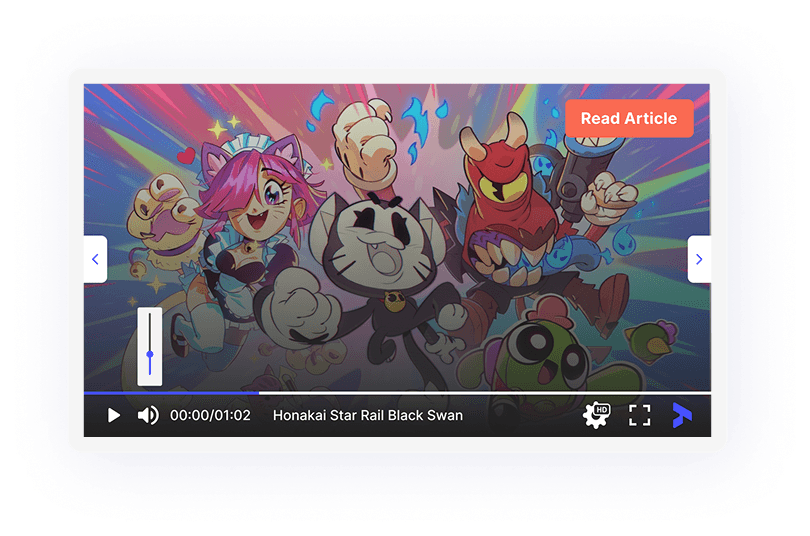
The existing product supported traditional horizontal playback but was not designed for vertical, social-style video consumption.
Research and direction
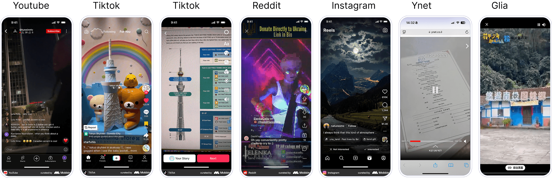
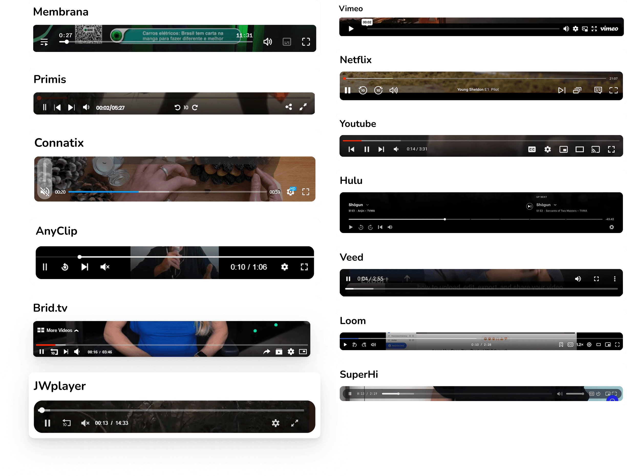
I combined product data with research into direct video-player competitors and familiar consumer platforms.
The data showed a large difference between mobile and desktop engagement:
4.56B player loads over three months.
2.8% total engagement.
2.5% mobile engagement.
0.3% desktop engagement.
This pointed to an opportunity to create a more engaging experience influenced by familiar mobile video patterns.
My research included direct industry players as well as YouTube, TikTok, Instagram, Vimeo, Netflix and Facebook.
Several patterns emerged:
Vertical video uses mobile screen space more effectively.
Swipe gestures make moving between videos feel natural.
Desktop users expect controls on hover.
Mobile users expect controls on tap.
Play, pause and navigation should use familiar gestures.
Controls should remain accessible without competing with the content.
Creator, title, sharing and reactions help create a social-video context.
These insights shaped five design values:
Content-first · Accessible · Uncluttered · Familiar · Social
1. Creating a vertical, social-first player
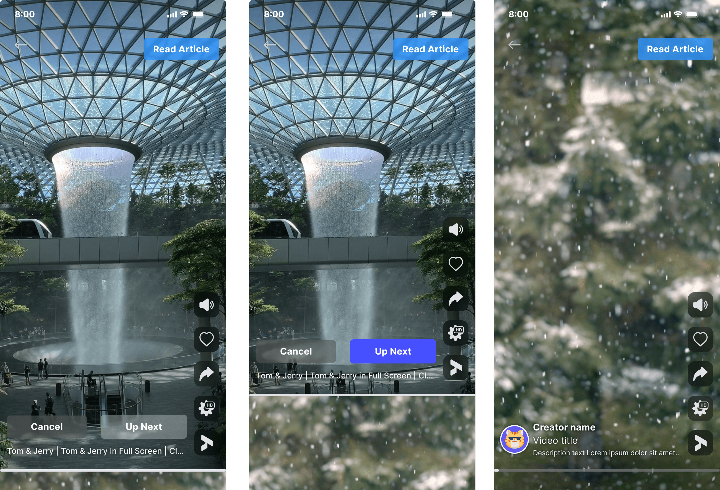
The largest product change was the introduction of a vertical player designed around short-form video behavior.
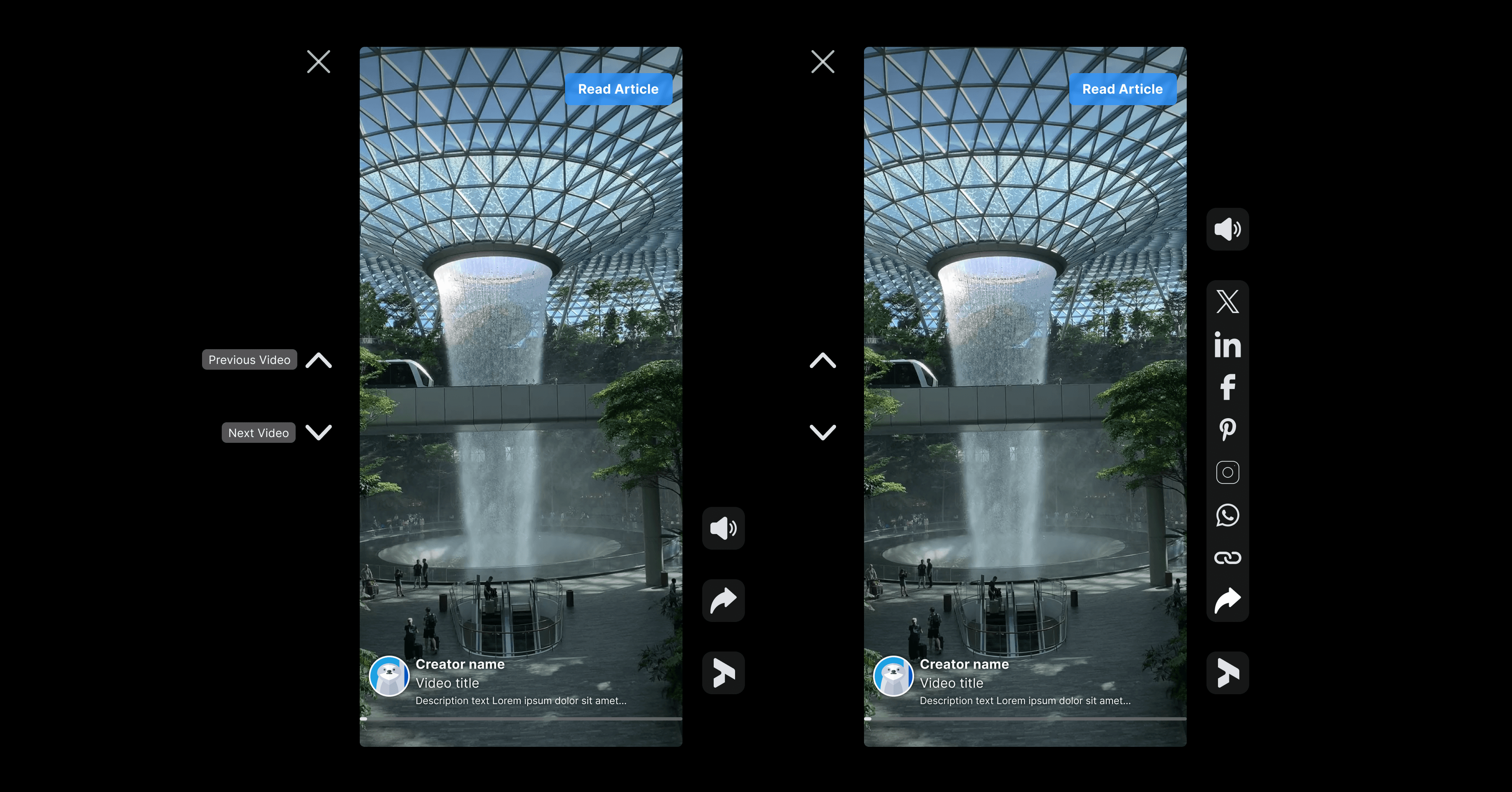
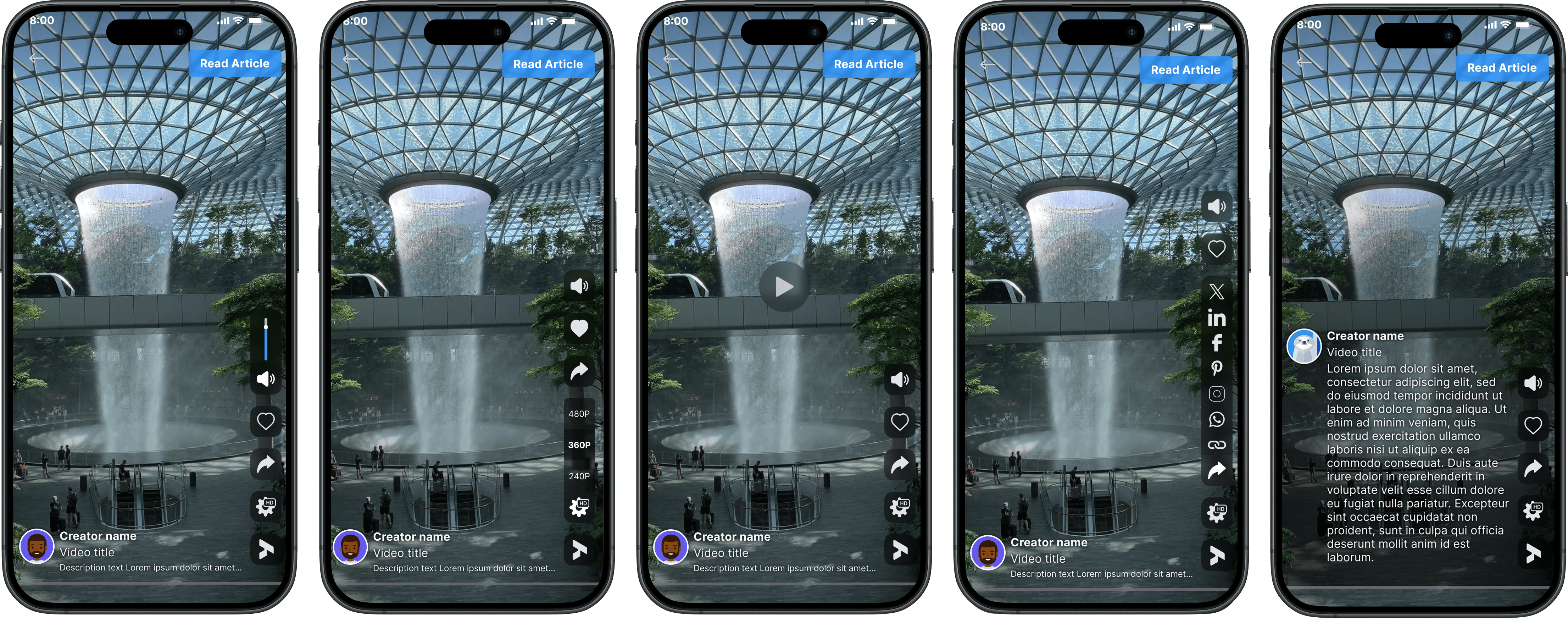
Rather than placing a vertical video inside a horizontal player frame, I designed a native vertical experience that uses the available screen height and places secondary actions along the side.
The player includes:
Swipe or directional navigation between videos.
Creator and video information.
Like and share actions.
A visible next-video hint.
Full-screen playback.
A clear “Tap for Sound” action.
Calls to action such as “Read Article.”
This creates a familiar social-media experience while preserving the company’s content and monetization requirements.

A native vertical experience built around familiar short-form video behavior.
2. Adapting social behavior to desktop
A vertical player on desktop cannot rely only on mobile conventions. It must remain intuitive when embedded beside article content and controlled with a mouse.
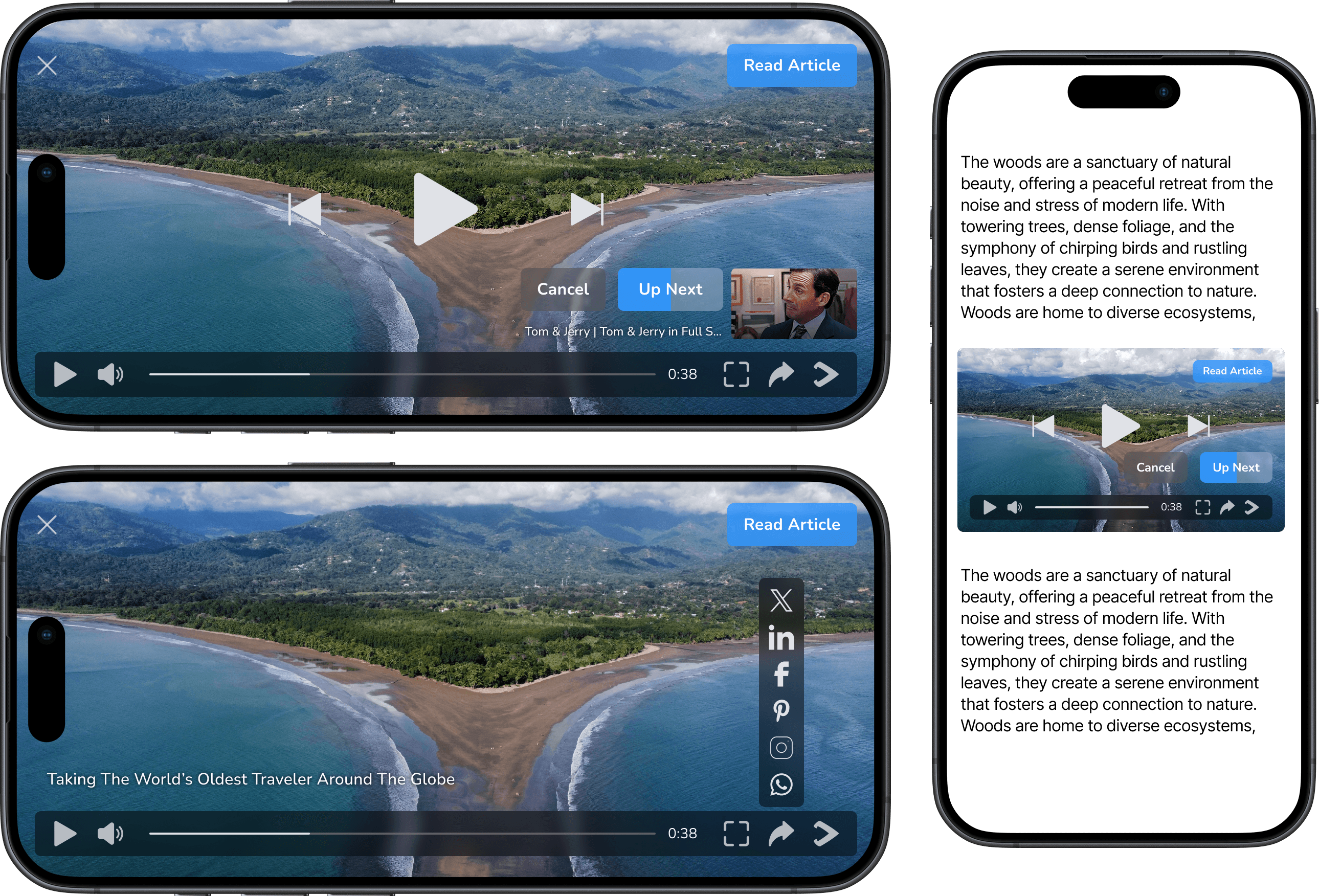
On desktop, the player preserves the vertical format while adapting its interactions:
Controls appear on hover.
Next and previous actions remain visible and accessible.
The player can expand into a larger focused view.
Full-screen mode preserves the vertical composition.
Creator, title and actions remain connected to the content.
The surrounding article remains visible when the player is not expanded.
This allowed the vertical player to feel social and content-focused without pretending that desktop usage is identical to mobile.
The same vertical experience was adapted to desktop input and publisher layouts.
3. Designing familiar mobile interactions
On mobile, controls appear on tap and the video can expand into a full-screen experience.
Users can move between videos using familiar vertical gestures. Visual hints introduce the interaction without covering the content, and upcoming video information creates a reason to continue watching.
The design also accounts for important playback states:
Muted autoplay.
Tap for Sound.
Play and pause.
Swipe to the next video.
Auto-skip countdown.
Loading and no-network states.
Likes, sharing and video information.
4. Modernizing the horizontal player
The project was not limited to adding a vertical format. I also redesigned the horizontal player so both experiences would belong to the same product system.
The updated horizontal player uses a cleaner control bar and reveals controls contextually instead of permanently covering the content.
I defined behavior for:
Click-to-play and pause.
Hover controls on desktop.
Tap controls on mobile.
Seek and playback progress.
Previous and next videos.
Sharing and tooltips.
Muted autoplay and Tap for Sound.
Auto-skip and “Up Next.”
Loading, no-network and full-screen states.
The player also adapts across several embedded sizes, preserving usable controls even in compact placements.
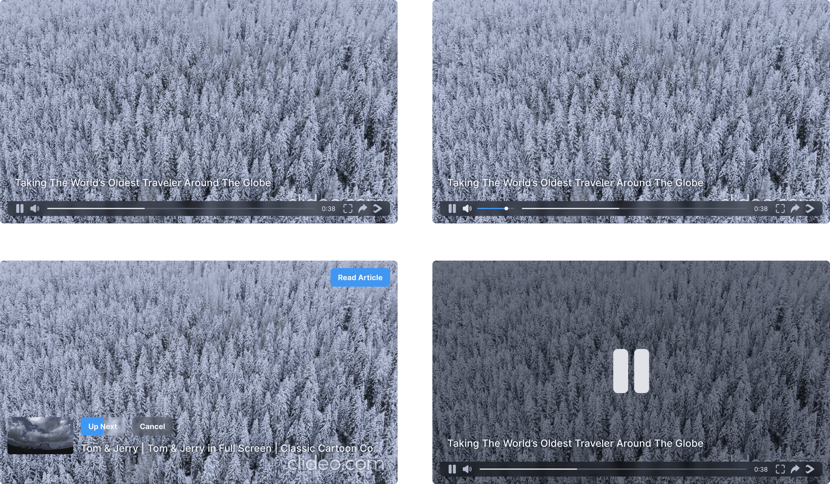
The horizontal player was simplified and rebuilt as part of the same responsive system.
5. Creating one system across formats
Although horizontal and vertical players provide different viewing experiences, they share the same core interaction language.
Reusable components include:
Play and pause.
Loading.
Tap for Sound.
Auto-skip.
Next and previous video navigation.
Sharing.
Tooltips.
Playback progress.
Error and network states.
The presentation of these components changes according to format, device and player size, while their meaning remains consistent.
This created a foundation that could support horizontal players, vertical players and carousel experiences without treating each layout as a separate product.

Shared behavior creates consistency, while each format remains optimized for its viewing context.
The final outcome
The redesign expanded the company’s core product from one horizontal player into a flexible video system designed for current content-consumption behavior.
The new experience provides:
Native horizontal and vertical formats.
Responsive desktop and mobile layouts.
Familiar social-video navigation.
Cleaner, contextual controls.
Better use of vertical screen space.
Clear muted-autoplay and sound behavior.
Engagement actions that do not overwhelm the content.
Consistent loading, error and playback states.
A scalable component foundation for future player formats.
Before and after
Before | After |
|---|---|
Horizontal video only | Horizontal and vertical experiences |
Outdated, fixed presentation | Responsive layouts across devices and sizes |
Controls focused mainly on playback | Playback, discovery and engagement actions |
Limited adaptation to context | Hover on desktop and tap or swipe on mobile |
No social-video experience | Creator, title, reactions, sharing and navigation |
Separate interface states | Shared player components and behavior |
Impact and next steps
The redesign established a new direction for the company’s main product, expanding it beyond traditional horizontal playback and introducing a vertical experience built around modern video-consumption patterns. The work also created a shared interaction system across formats, devices and player sizes.
The original success goal was to increase engaging clicks by at least 1.5%.
I would evaluate the released experience using:
Engagement clicks by player format.
Video completion rate.
Videos viewed per session.
Interaction with Like, Share and Read Article.
Tap for Sound activation.
Advertising exposure.
Desktop versus mobile engagement.
Reflection
The main challenge was balancing two contexts: the player needed to feel as intuitive as a social-video product while remaining suitable for publisher websites, advertising and embedded content.
Researching both direct competitors and familiar consumer platforms helped distinguish expected industry behavior from opportunities to create a more engaging experience.